City Wayfinding Havana
Inspiration: An insight on The City Wayfinding Havana about typography, street slogans, color use and wayfinding.
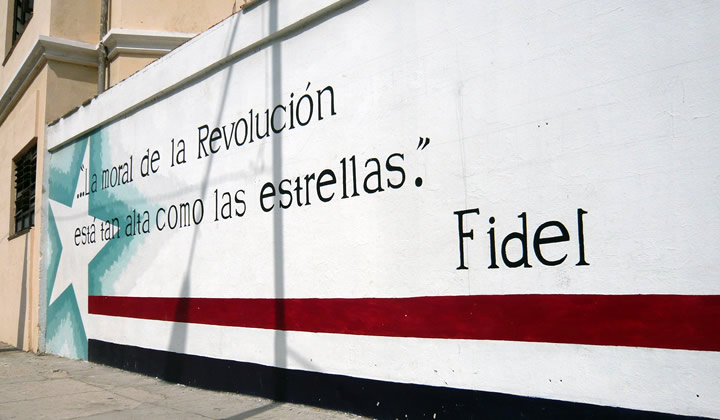
The Cuba that we know is a very restricted, communism country. Yet was striking to see that environmental graphic design and wayfinding are thought well through. From a propaganda point of reference, it is understandable to communicate on a physical street level to interact with the local community. Everywhere in the city slogans from the Fidel regime are painted on the walls.
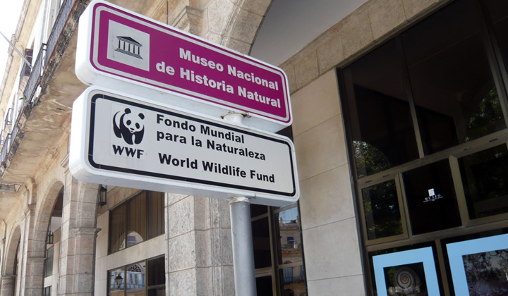
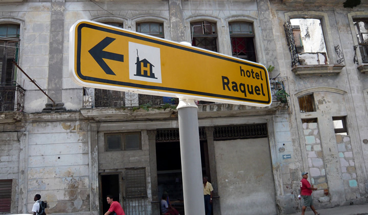
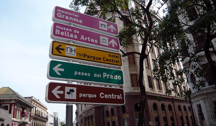
But, what was noticeable was the city wayfinding. A comprehensive wayfinding system is implemented throughout Havana. This article will feature the characteristics of the Havana city wayfinding system.
Streets and signs of Cuba
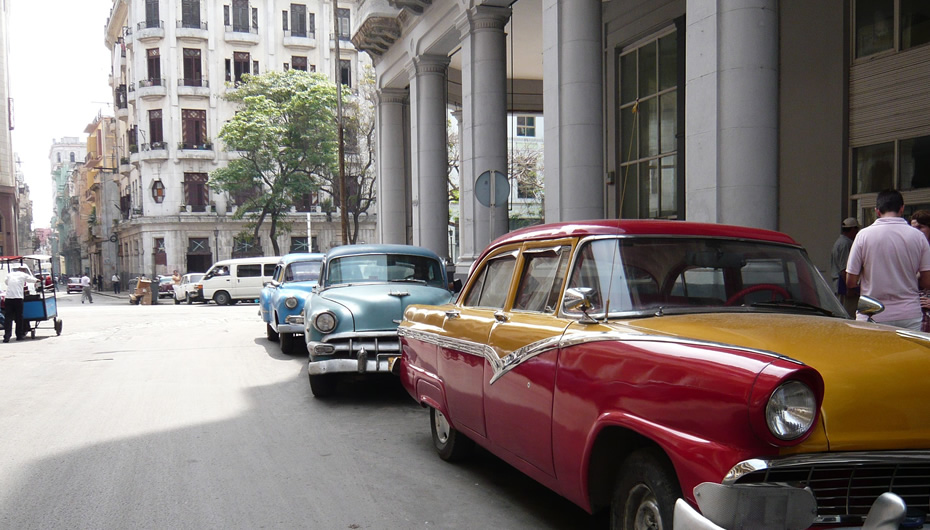
The street life in Cuba is a great contrast to the Western world. The atmosphere is authentic and feels like a movie from the fifties. The streets of Havana, the small way of living and the local customs puts our every day life (what we take for granted) in perspective.
Typography, color and symbol signs
The consistency in placement, readability of text, arrows usage and symbol signs are balanced and it seems there is a graphic standard in place. We tried to determine who designed the wayfinding system and we would be interested knowing which agency or authority designed this. If you know who designed the Havana city wayfinding please let us know (see contact details below).
Overall the city wayfinding system in Havana gave a good experience of the city and was a guidance along the tourist attractions.
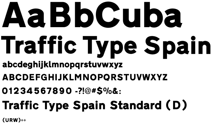
With the help of typographic tools we discovered the typeface used in the signs; Traffic Type Spain. The font has an authentic look and feel and fits well into the Cuban environment. The arrow design seems to originating from the Aiga Symbol Sign collection. The symbol signs referring to museums, parks and memorials seems to a familiarity with standardized symbol signs collections.
Traffic Type Spain Standard (D)
Originally, the font “Traffic Type Spain” designed in the pre-digital area around eighties. Then there were no ready to use outline fonts and to manufacture traffic signs they had to cut letterings by hand or manually compose them from single stamp letters.
URW developed sign-making software called SIGNUS, the first of its kind used to cut letters and logo in vinyl. Due the popular demand of SIGNUS, URW designed the digital outline fonts for road signs for European countries.
Under the technical direction of Peter Karow, URW led the world in developing digital font technology. Its IKARUS suite of font digitization tools and file format standards handles fonts as bitmaps, as grey scale (anti-aliased bitmaps), as vector outlines, and as curved outlines.
The fonts are designed specific to country regulations. The artwork for the fonts was mostly provided the sign-making companies who would produce the traffic letterings for the corresponding governmental traffic offices. The digital production and completion of the character set was done at URW.
The name “Traffic Type Spain” was given by URW. They named them all “Traffic Type” plus the country, like Traffic Type Sweden, Traffic Type Luxembourg, etc. This meant that the font was officially used to produce the traffic signs in for instance Spain.
We can only imagine why the Spanish variant is chosen for the sign system, it could have been an accidental choice or something to do with the Cuba history or Spanish influence. We estimate the wayfinding system was implemented about ten years ago and have regular updates.
More about the font
The font “Traffic Type Spain” and other country related fonts are available via URW++ website. Below you will also find a reference to Ikarus Typography Software used to digitize paper fonts for digital use.
Special thanks to Peter Rosenfeld of URW++ Design & Development GmbH for contributing to this article with background details and information about the font Traffic Type Spain.