Rotis is everywhere
Otl Aicher one of the leading German graphic designers developed in 1988 the typeface Rotis, named after the town Olt Aicher lived in.
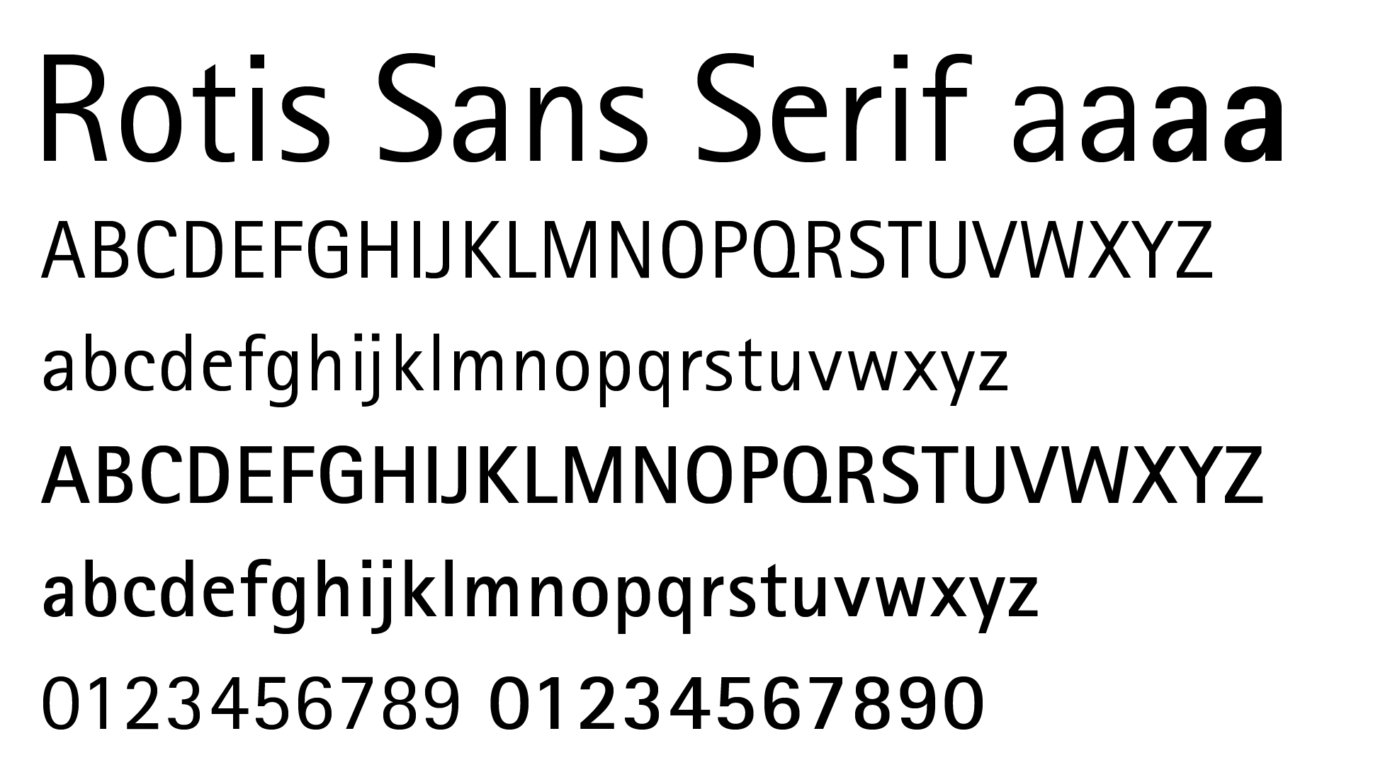
Typeface Rotis Serif
Available in four font families from sans to serif, Rotis typeface can be found everywhere around you. Unfortunally Olt Aicher died in a traffic accident in 1991. Linotype currently owns the Rotis Font Family, where all of the font variations can be bought.
Rotis® gives an impression of both strength and generosity and all four versions can be used interchangeably with one another. Rotis® is suitable for book/text, documentation/business reports, business correspondence, magazines, newspapers, posters, advertiments, multimedia, corporate design.
Linotype
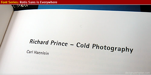
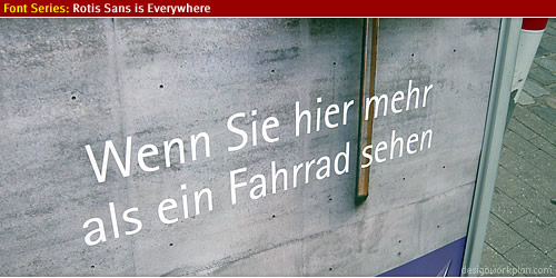
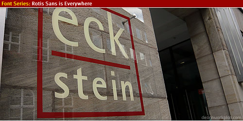
During our holiday in the beautiful German Steigerwald (near Nürnberg and Bamberg) I came across the Rotis Font Family quite often, this is a photo showcase collection of the Font Familiy Rotis Sans.
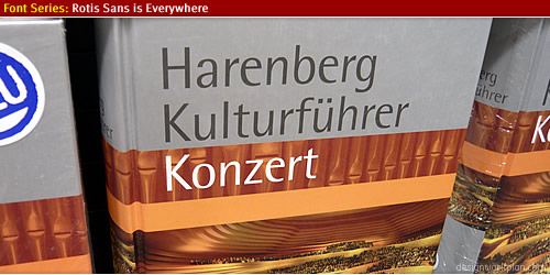
Boek
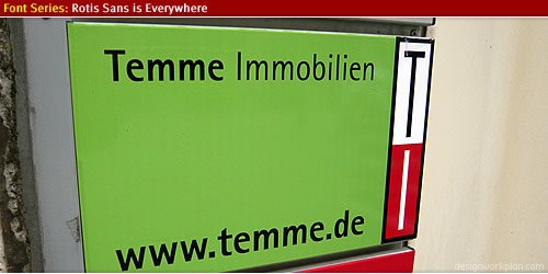
Street Signs
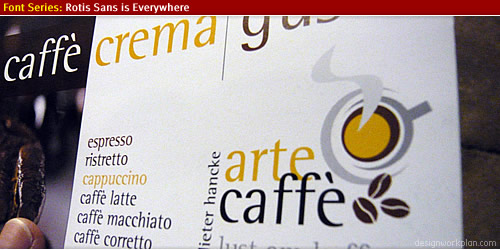
Cafe Signage
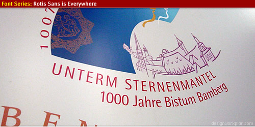
1000 Jahre Bamberg
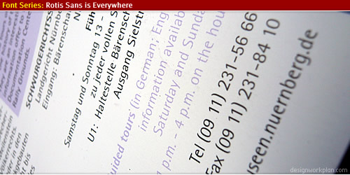
Museum Nürnberg
Shopping
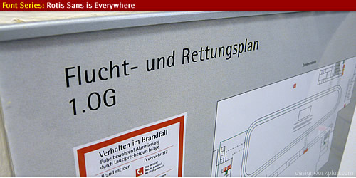
Escape route plan
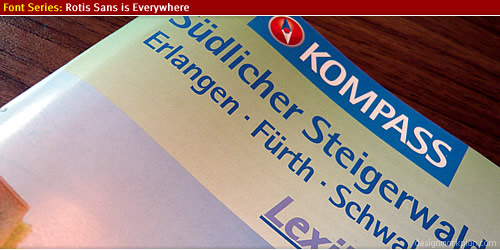
Bookstore
Door Signage
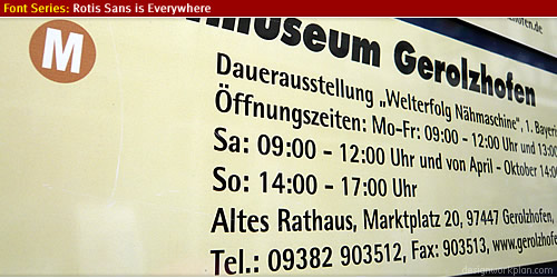
Museum Gerolzhofen
Arte Caffe
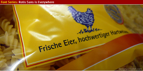
Kind of noodles
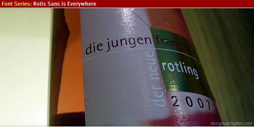
Rotling Wine
Steigerwald walk
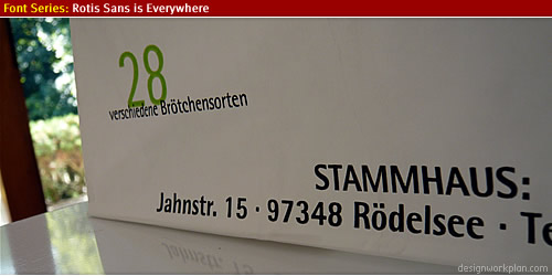
Shoppingbag
(wrapper)
Where to get Rotis?
The font package is available in four type families, via Linotype:
Personally I like Rotis Sans Serif Font Family (2nd on the list above) the best, it has a very distinctive look and feel with a high legibilty for usage in many fields of visual communication.
More information about Olt Aicher
There is much written about Olt Aicher who was not only a font designer but also a graphic designer who had a big part in designing the Münich Olympic Games in 1972.
- Information about Olt Aicher at Wikipedia.
- Great article about Olt Aicher at Underconsideration.
- Work from Olt Aicher at a huge flickr pool to be found here.
- The graphic design work he created for the Münich Olympic Games at this website.
- Other interesting and informative article about the type Rotis, here at manic.com.
(/wrapper)