Architectural signage
Outstanding examples of architectural signage
This article is a show case of the relationship between architecture and graphic design. In fact, surprisingly few architects use typographical elements in their design. For this overview of projects that do make good use of lettering, I’ve probably browsed through more than thousand Architectural Designs. Below you’ll find ten buildings on integrated architectural lettering and signage
I can only guess about the reason why architects make so little use of typhographical elements on their buildings. The main reason will be that the building design doesn’t need it. Most buildings can make their function clear without the use of signage on the façade. As you will find on the buildings listed below, architects used the signage to show the name of the building to the world; there is no building to be found with its function printed on it. The function is supposed to be clear.
A famous architect once stated: ‘form follows function’. That’s why you know what the particular function of a building is. Architects follow their mantra.
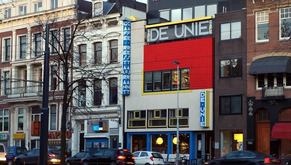
Café de Unie (The Union), Rotterdam, The Netherlands
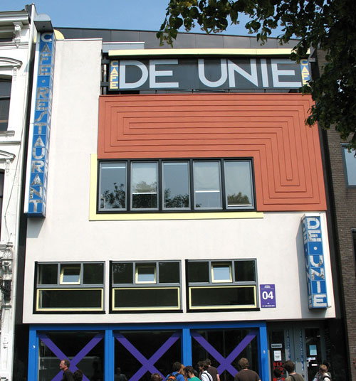
You can find this building near Rotterdam central station. It was destroyed during the second world war and has been rebuild in 1985, 500 meters from its original place.
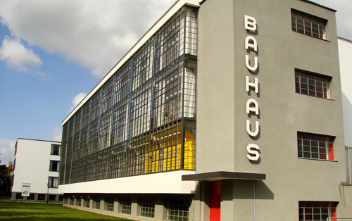
Bauhaus, Dessau, Germany
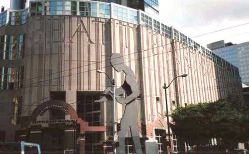
Seattle Art Museum, U.S.A.
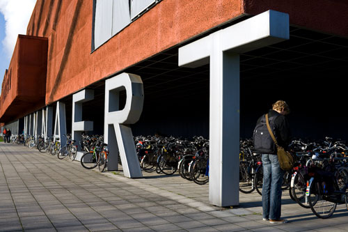
Minnaert building
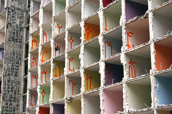
Terror Háza múzeum / House of Terror museum
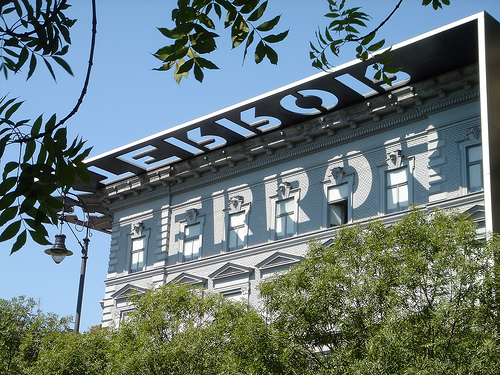
The reconstruction turned the exterior of the building into somewhat of a monument; the black exterior structure (consisting of the decorative entablature, the blade walls, and the granite sidewalk) provides a frame for the museum, making it stand out in sharp contrast to the other buildings on Andrássy Avenue. Wikipedia.
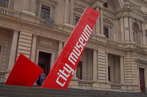
City Museum Melbourne, Australia
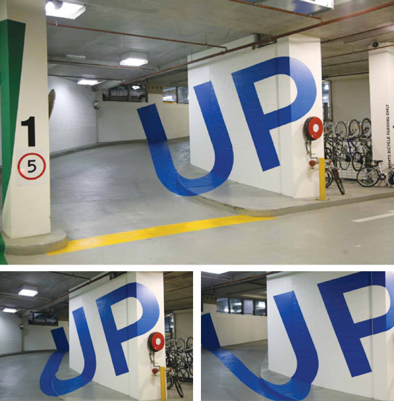
Eureka Tower Carpark
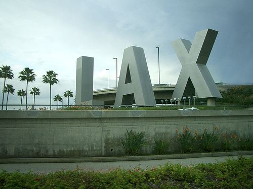
LAX
Art school made me do this
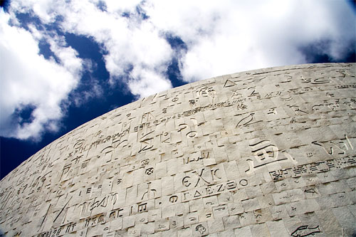
Library of Alexandria, Egypt
This is a guest post by Frank van Leersum, a Dutch student architecture who likes to write about architecture and books. Visit his Dutch weblog Aureon.