Architectural signage

Outstanding examples of architectural signage
Architectural signage

This article is a show case of the relationship between architecture and graphic design. In fact, surprisingly few architects use typographical elements in their design. For this overview of projects that do make good use of lettering, I’ve probably browsed through more than thousand Architectural Designs. Below you’ll find ten buildings on integrated architectural lettering and signage
I can only guess about the reason why architects make so little use of typhographical elements on their buildings. The main reason will be that the building design doesn’t need it. Most buildings can make their function clear without the use of signage on the façade. As you will find on the buildings listed below, architects used the signage to show the name of the building to the world; there is no building to be found with its function printed on it. The function is supposed to be clear.

A famous architect once stated: ‘form follows function’. That’s why you know what the particular function of a building is. Architects follow their mantra.

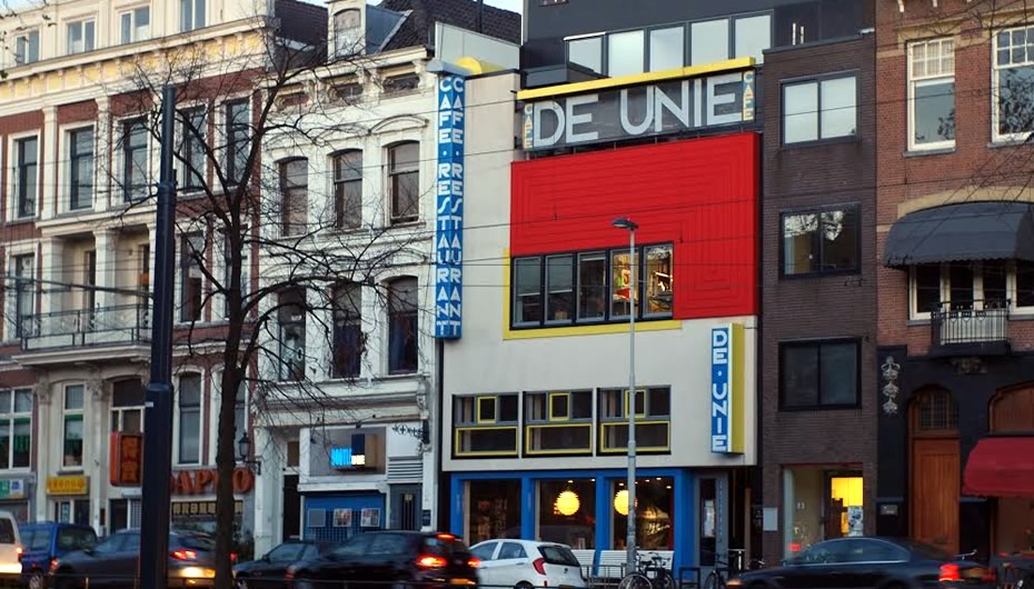
Café de Unie (The Union), Rotterdam, The Netherlands
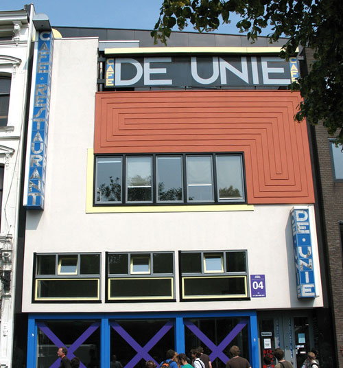
One of the first uses of typographic lettering in architecture is the façade of the café ‘De Unie’. This building was completed in 1925, and has the looks of a Mondriaan painting. From the outside the building looks very much like the front cover of the design magazine ‘De Stijl’ (The Style). This similarity is no coincidence; the architect was a member of the Style movement. Members from various disciplines, like architects, graphic designers and interior designers had a strong influence on each other.

You can find this building near Rotterdam central station. It was destroyed during the second world war and has been rebuild in 1985, 500 meters from its original place.

Bauhaus, Dessau, Germany
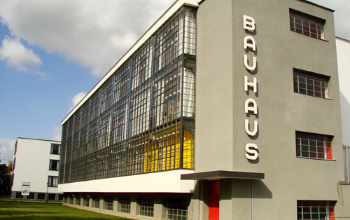
At art school, everyone learns about Walter Gropius and his Bauhaus movement. The Bauhaus has been very influential in architecture and other disciplines of art. This modernist building was build in 1926 and has a beautiful lettering on its front façade.

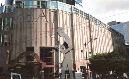
Seattle Art Museum, U.S.A.

In 1991, Pritzker Prize winner Robert Venturi designed the Seattle art museum. To make sure no other use will ever be made of the building, ‘Seattle Art Museum’ has been carved into the front façade.

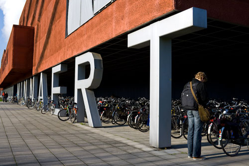
Minnaert building

The Minnaert building on the campus of Utrecht University has been named after the Belgian astronomer Marcel Minnaert. The architectural firm Neutelings Rietdijk has made very original use of huge letters to give the building its name. The columns that carry the upper levels are integrated within the letters.

Terror Háza múzeum / House of Terror museum
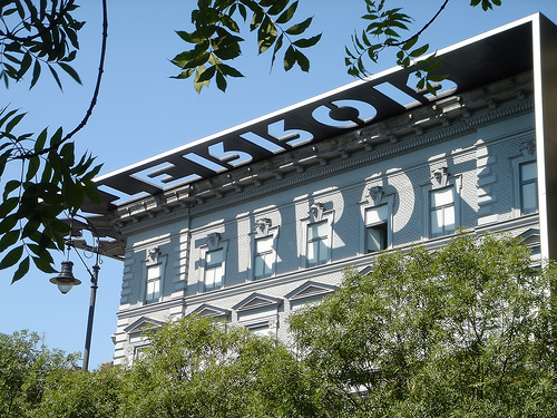
House of Terror is a museum located at Andrássy út 60 in Budapest, Hungary. Designed by architects János Sándor and Kálmán Újszászy.

The reconstruction turned the exterior of the building into somewhat of a monument; the black exterior structure (consisting of the decorative entablature, the blade walls, and the granite sidewalk) provides a frame for the museum, making it stand out in sharp contrast to the other buildings on Andrássy Avenue. Wikipedia.

City Museum Melbourne, Australia
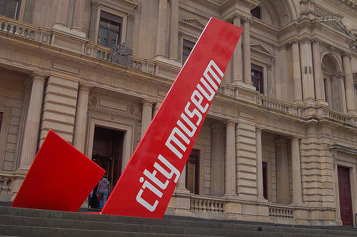
Designed by Garry Emery, Mark Janetzki and Ben Kluger for the City Museum Melbourne. This large folded monumental sign draws the attention to the museum and gives direction to the entrance.

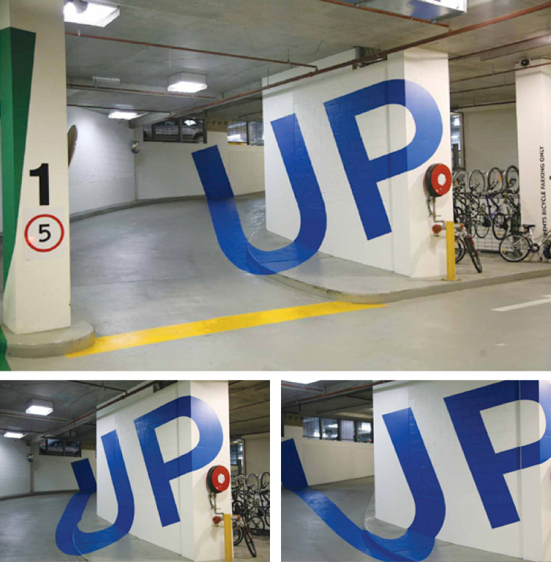
Eureka Tower Carpark

Also designed by the Emery Studio Melbourne, big painted letters on the walls and floor, looking directly the letters are distored but standing in a right position the letters can be read perfectly. Fabulously done artwork by Axel Peemoeller.

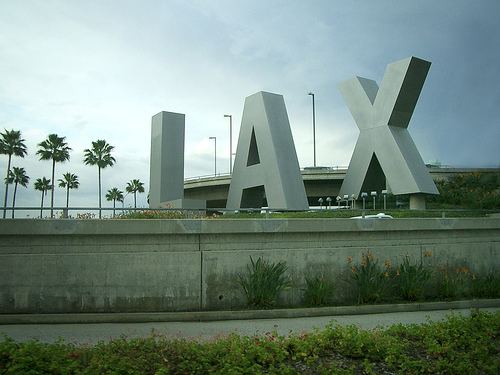
LAX

One of the large LAX signs that greet visitors to Los Angeles International Airport. This sign is at the Century Boulevard entrance to the airport.

Art school made me do this

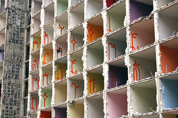
A fun project by Rutger de vries (Perongeluk) who used this old building to express his design ideas. It was doomed to demolition, the former nursing home in Utrecht (The Netherlands). After the elderly residents had been relocated, it had served as a student residence for another six years, but now it stood empty. Rutger de Vries says: “My work is transitory in nature; in fact I prefer to present it in places that have almost ceased to exist, where it can contrast with the setting“

Library of Alexandria, Egypt

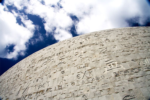
Snøhetta is a Norwegian architectural firm with a very beautiful website. The buildings they design are fine too. Take for example the library in Alexandria, a huge cylinder covered with concrete plating. On those plates you can see all kinds of typographical elements in non western languages, mostly hieroglyphs.

This is a guest post by Frank van Leersum, a Dutch student architecture who likes to write about architecture and books. Visit his Dutch weblog Aureon.