Introduction to wayfinding
This article is an introduction to sign design and how wayfinding works. You will learn about wayfinding, signage design and typography to create a clear and concise wayfinding system that applies the built environment.
Orientation and navigation
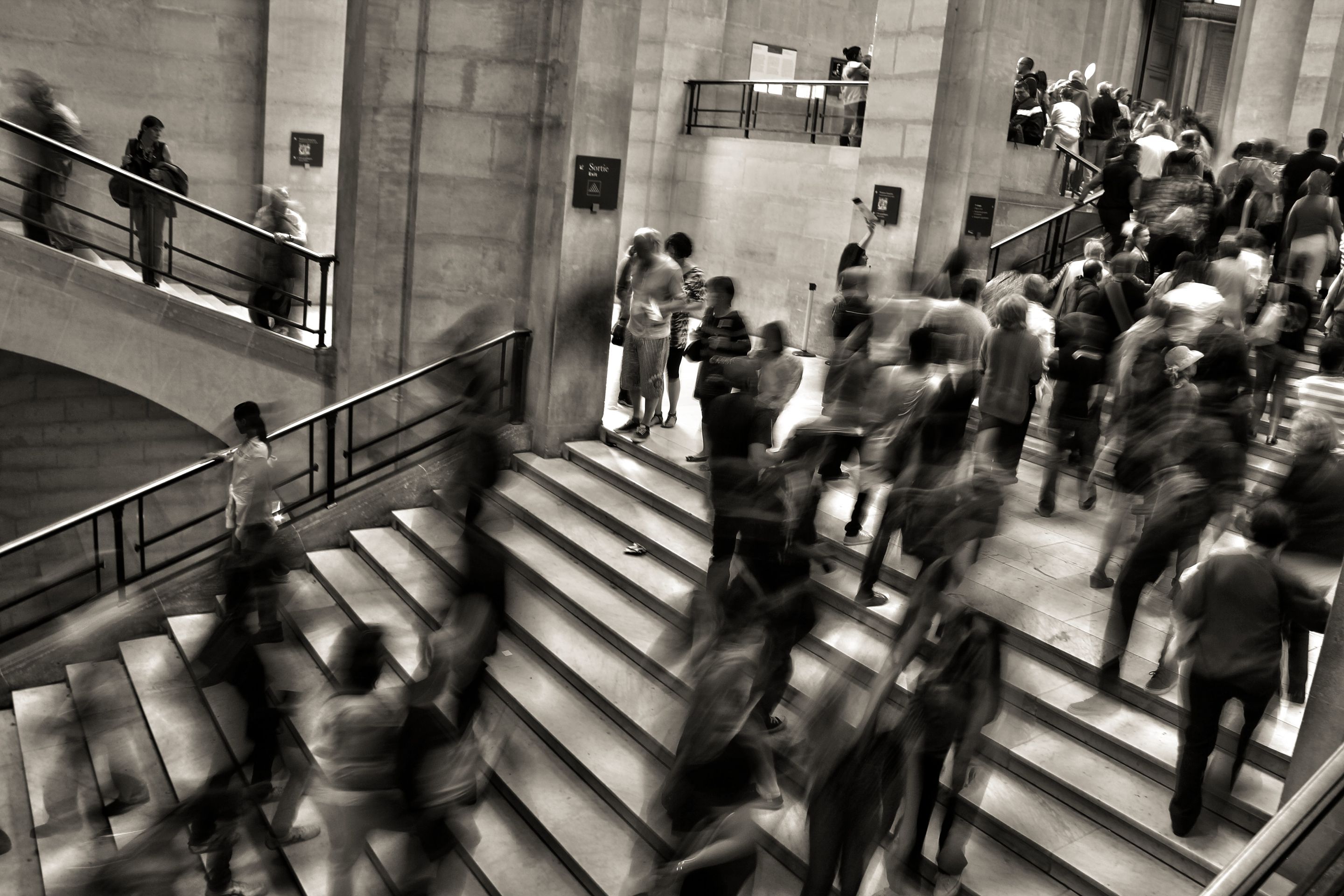
Navigation from place to place is a fundamental human activity and an integral part of everyday life. Where are you? Where are you heading to? People use their knowledge and previous experiences to find their way in the built environment. The human perception of the built environment and information in a space comes down to balance and focus. What do you see? Why did you see it? What did you do with the information.
Wayfinding principles
Wayfinding has the function to inform people of the surroundings in the (unfamiliar) built environment, it is important to show information at strategic points to guide people into the right directions. Complex structures in the built environment are interpreted and stored by the human memory. Distances, locations and time may be remembered differently than as they appear to be in reality.
An effective wayfinding system is based on human behavior and consists of the following characteristics:
- Do not make them think
Create a comprehensive, clear and consistent visual communication system with concise messaging. - Show only what is needed
Show information that is relevant to the space, location and / or navigation path. - Remove excessive information
Remove unnecessary elements to create a clear visual environment ahead.
How does wayfinding work?
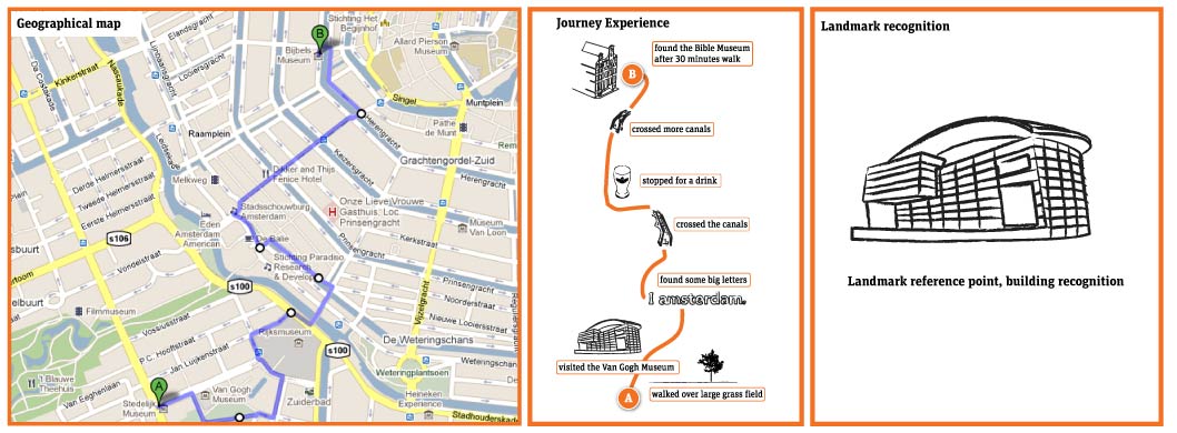
How do people orientate, navigate or remember the built environment? Why will people recognize or understand one place easier than another? As shown in the images on the left, a geographical map versus cognitive (mental) map = reality versus human mental memory. When creating a wayfinding scheme the following characteristics influences the way we interpreted the built environment.
- Landmarks
To create a legible environment it is necessary to mark specific spaces and / or locations. This reinforces the recognition of places and plays a part in overseeing a larger area. With the use of landmarks and marking elements an area will become more visible and will be understand better in the human memory. Landmarks can be art-objects, buildings, streetart, wayfinding signs or striking elements in a landscape. These elements combined will shape the identity of an (unknown) area as seen from your perspective. - Orientation
In order to navigate, you need to know where you are in the built environment and where other destinations are located. Preferable it is good to know the distance in time from one place to another. If you are able to orientate yourself within the built environment, it will be easier to understand destinations and to navigate by landmarks. In wayfinding, maps are common used to indicate your location. The usage of maps is a very powerful way of expressing and overseeing the built environment. Be sure to display the maps heads-up in the direction you are facing, this way you can easy relate yourself to the built environment. - Navigation
Navigating the physical reference to a particular area, setting or destination. With the usage of directional (static) signs people will be guided along their path towards destination(s).
Strategic wayfinding design
When creating a signage system for an area, building or architectural structure it is essential to develop a strategic wayfinding scheme. With this step you are able to build up a modular wayfinding system that will adapt to the built environment and the human expectations for orientation and navigation purposes. Research is an important step to understand the built environment and where information is needed to maximize legibility of the wayfinding system.
Signage design principles
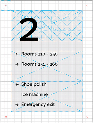
There are four important type of signs: Information signs, for instance a signpole with locate a destination and / or to orientate yourself in the built environment.
Directional signs, where information is displayed to find destinations, located on several strategic points in the built environment.
Identification signs, where information about individual locations is displayed such as buildings, locations and public facilities.
Warning signs, to indicate safety procedures such as a fire escape routes, no smoking areas and other regulations that is, or is not allowed in a specific area.
To make a signage system work together a design grid is used to order information and to scale the signs to different sizes, as part of the sign family. With the example design I have used a base grid of 30 mm (milimeters) with a subdivision of 9. All the measurements of the example are based on the 9×9 division. Be careful not to show too much information into one sign, this will be easily overlooked, instead use multiple signs to get good wayfinding results.
Signage typeface
A signage typeface is usually a sans-serif type and available in various weights with a simple easy-to-read straightforward design. They have a good legibility with a large X-Height and wide letter proportions with prominent ascenders / descenders to ensure a good readability.
When using an easy-to-read font the typeface is recognizable for many people to read and to understand the message clearly. Therefore the choice of a signage typeface is one of the keyfactors in order to make a wayfinding system work. When selecting a typeface for a signage design / wayfinding project please use the following characteristics:
- A clear and straightforward type design, sans-serif
- Easy recognizable letterforms
- Positive letter spacing to enhance the visual appearance
- The Font Family includes a package of many different weights
- The typeface has a large X-height for good readability
Signage design
Be consistent in typography, type height, icons, grid design, color and material choice. The signs needs to be straight forward designed and in a consistent order to wayfinding scheme, always use the same order of displaying the information. Remember to make samples of the different sign types and check them in the built environment to ensure it becomes a best-practice design.