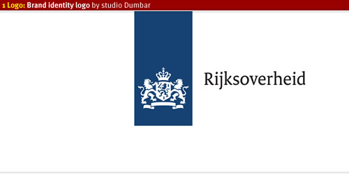
Dutch government corporate identity
As part of the new brand identity of the Dutch government Peter Verheul designed a custom typeface for all forms of visual communications
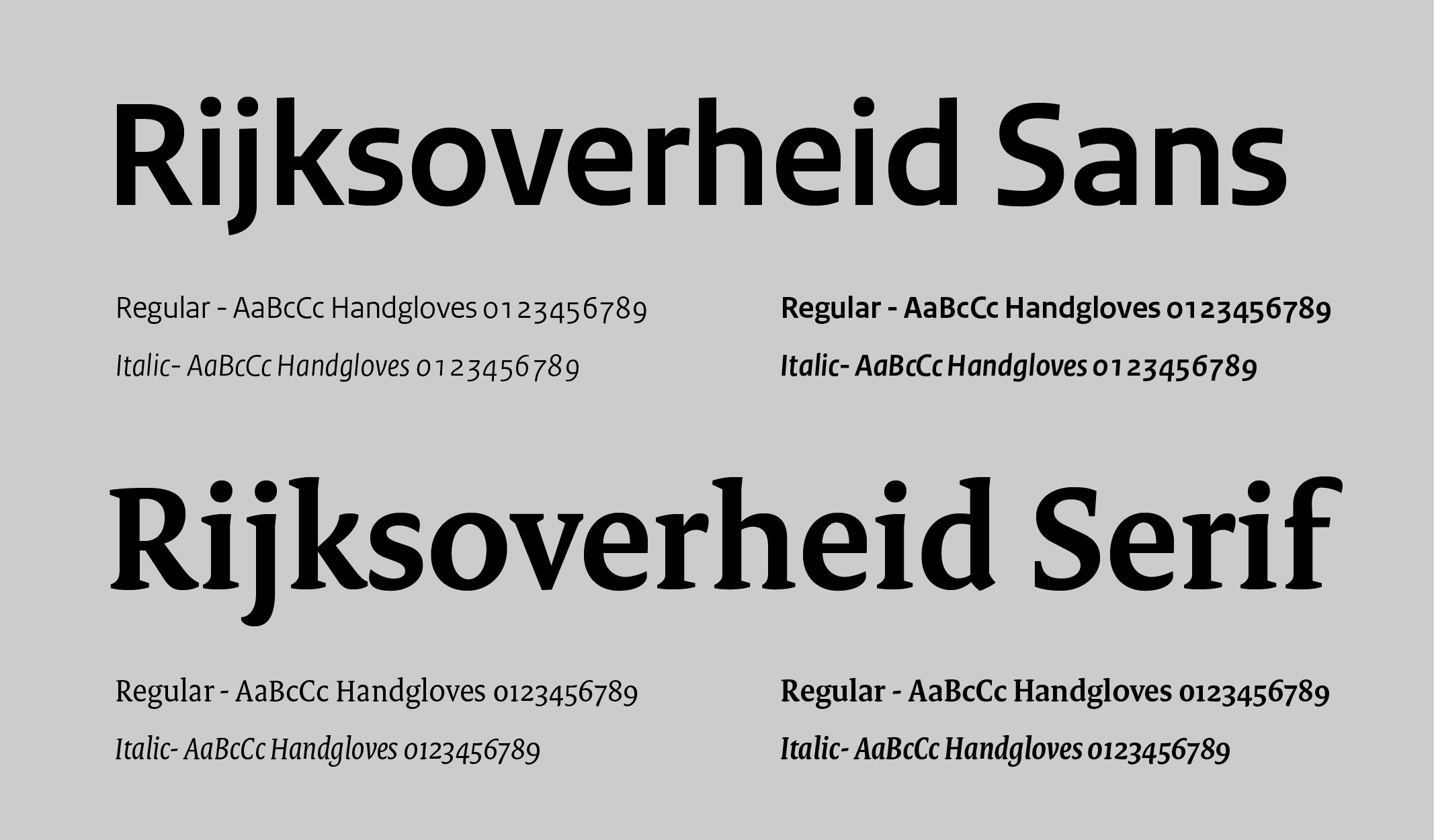
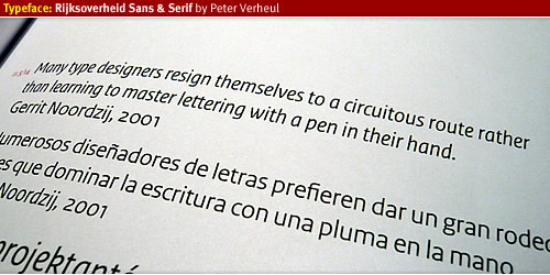
Typeface: Rijksoverheid Sans / Serif
Currently there are over 200 departments and ministries which all have different logos and uses different typefaces as their brand identity. In a pitch held by the Dutch government studio Dumbar won this competition and introduced a new logo and 1 brand identity: 1 Logo.
From the beginning of 2008 Peter Verheul was asked by studio Dumbar to take his typeface Versa and transform the typeface usable for a larger audience. He changed the look and feel of the Serif version of Versa Serif and created a complete new set of letters for the Sans version. The fonts are named Rijksoverheid Sans and Rijksoverheid Serif. The name of the typeface is recognizable as “government” and will be used in every way of visual communication.
The Rijksoverheid Sans will be used mainly for headings of text and in signage or wayfinding systems. The Rijksoverheid Serif is used as bread letter for reading text. In just under nine months Peter Verheul managed to finalize the fonts and released them in four different variations, from Regular, Italic to Bold.
Designing the Rijksoverheid typeface
Letterijk book
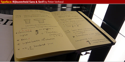
During the time of creation Peter Verheul did not have much time to take pictures (as said in his introduction speech) but he kept a note book full of drawings and notes of creating and designing the typefaces. After finishing the typefaces he donated them to Bijzondere Collecties, a Dutch important collection of valuable work from Dutch graphical, typographical- artists. The Bijzondere Collections hosts the booklet, first printouts and everything that is related in creating the typeface Rijksoverheid.
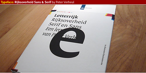
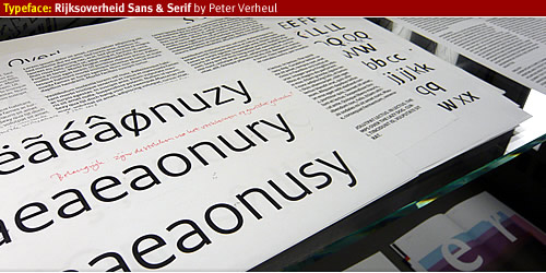
Letterrijk Book is a story about the birth and why of creation the typeface Rijksoverheid written by Mathieu Lommen, published by De Buitenkant Publishers. The booklet covers everything from the start of the project and the combination with project 1 Logo, a story about how the typography started working together, with many drawn examples of early stages of letter design. It also covers the complete glyphs of the typeface variations, with over 700 glyphs each this typeface is multi-language proof. With the design of the typeface several key factors of demands where given to Peter Verheul and Studio Dumbar.
The typeface should be easy to read, should not be too wide in order to reduce printing costs, it could be used for all forms of visual communication of the Dutch Government and every department will use it therefore it will reduce the costs of different typeface licenses. The typeface will function as a bridge between society and government, a typeface that everybody will feel comfortable with.
Rijksoverheids typeface
The Rijksoverheid Sans, an easy to read typeface with a large x-height. This allows maximum legibility for heading text, signage, wayfinding and other forms of visual identity. In the introduction speech Peter Verheul mentioned that he was impressed by the way the Sans version would be used for bread letter. He is interested to see the further development of Rijksoverheid Sans in this field.
Rijksoverheid Serif is the bread letter for reading text, I have read the booklet a couple of times and it seems to be a very legible typeface. Which will form the basis of the whole brand identity of the Dutch Government.
Project 1 Logo
The Dutch government brand identity was not concise or consistent, with over 200 departments and ministries costs were rising of each department havigd their own logo, typeface, print materials, signage and everything that involves the visual communication of that department. There was not a direct link to society and confusion about the identity the government wants to presents themselves. Project 1 Logo was born to bring back all brand identity of the Dutch government and give one signal to society about what the government stands for. In a pitch several design studios participated in order to create 1 Logo, 1 brand, 1 identity, 1 way of communicating between society and government, coming all together as 1 government.
From 2009 until 2011 every department should use the new logo and typeface in all forms of visual communication, a huge operation which involves many parties. I believe there will be a brand guideline from studio Dumbar to lead everything into the correct, concise and consistent use of the brand identity.
Read more
- Studio Dumbar, the designer of 1 Logo identity.
- Dutch government website about project 1 Logo, Rijkshuisstijl.
- Website of designer Peter Verheul