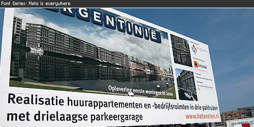
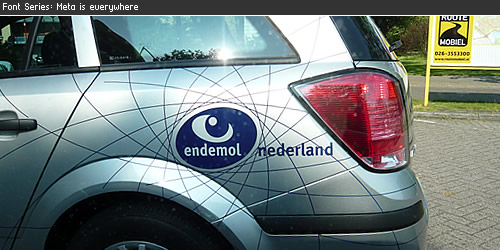
FF Meta is everywhere
Erik Spiekermann finest is everywhere
You can find FF Meta all around you, this is a collection of designs where we found the use of typeface FF Meta.
FF Meta® is a wonderful typeface designed by Erik Spiekermann, the font family was released between 1991 and 1998. A very readable typeface in smaller point sizes but also with enough detail to display in large point sizes. FF Meta is a sans-serif typeface which can be found all around you. The last several months where every I came (The Netherlands) I saw typeface Meta, in this font series you can see the many different faces of the FF Meta®.
Construction Billboard
Vehicle logo Endemol
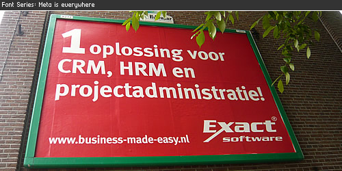
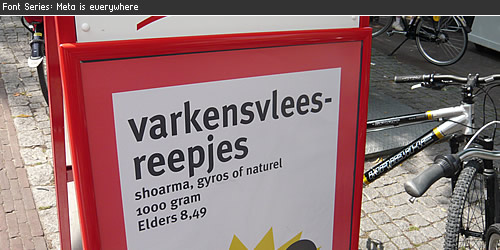
Big billboard
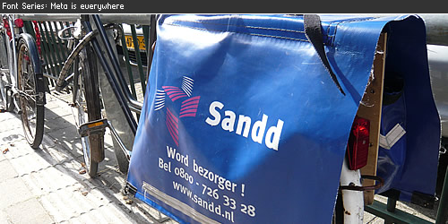
Bike Bag
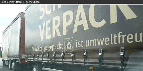
Truck on the highway
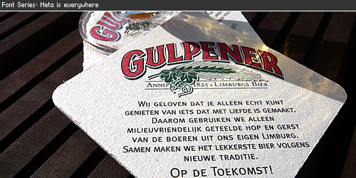
Gulpener Beer
Supermarket Coop
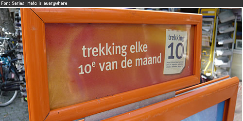
Staatsloterij / Lottery
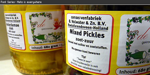
Meta Pickles
Lekker bij Rosé

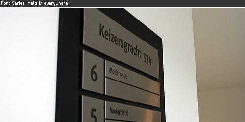
Signage
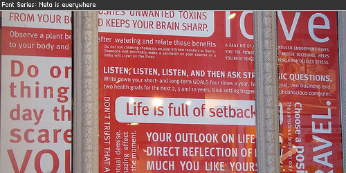
Shopping Window
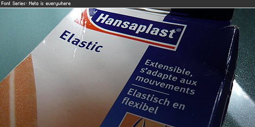
Elastic Bandage
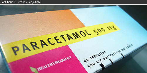
No more headache
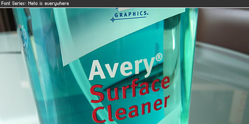
Avery Surface Cleaner
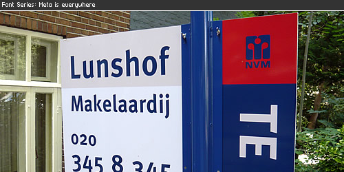
Real Estate Sign
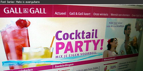
Gall & Gall
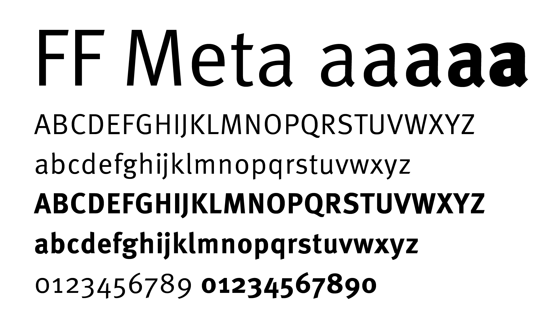
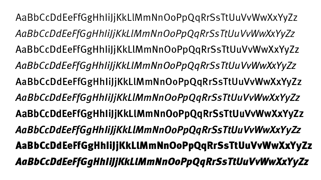
FF Meta
The Complete Font Family contains a package of 24 variations (via FontShop) and was published by FontFont (see their website for lots of Meta usage), is available in the following formats Mac PostScript, PC PostScript, PC TrueType. All styles Book, Caps, Bold and Bold Caps are also available in Italic. Starting from a set of 3 fonts at € 40,- to the complete font family for € 229,-. When bought at FontShop you can download the fonts after the purchase and start using them right away. Although FF Meta® is not in the top 10 bestsellers at FontShop I believe this is a very popular font.
- Visit FontShop for a complete overview of the Meta Font Family 1
- The complete overview of 55 variants of Meta Font Family.
- The Meta 3 Font package which contains Meta Hairline, Meta Thin & Meta Light. (Thank you Stephen Coles for adding the links)
- Wikipedia information page about the font Meta