Arial is everywhere
OMG Arial is really everywhere
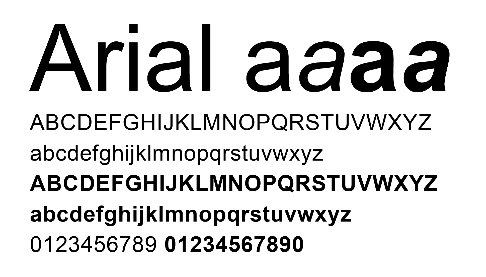
Arial, a contemporary sans serif typeface by Robin Nicholas and Patricia Saunders designed for Monotype in 1982. If you are familiar with a computer you must know Arial, one the most used “standard” typefaces for “normal” computer usage.
Arial
Most professional designers and typophiles think of Arial as a copied typeface from Helvetica and while reading the The Scourge of Arial by Mark Simonson Studio I have realized this is in fact a true story.
The typeface became free with the release of Windows 3.1, which was a sales hit and Arial quickly gained spread around the globe. The main reason why Microsoft chose Arial as standard typeface is because of the license fee from the original Helvectia typeface by the Haas Foundry was too high. Missed change to educate the world about the wonderful Grotesk family.
Arial vs Helvetica

- Visit Arial vs Helvetica on iLoveTypography
Today Arial belongs to Monotype:
Arial is an extremely versatile family of typefaces which can be used with equal success for text setting in reports, presentations, magazines etc, and for display use in newspapers, advertising and promotions.
Arial is everywhere!
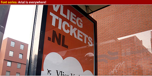
Advertisement sign

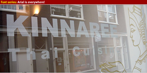
Thai cuisine
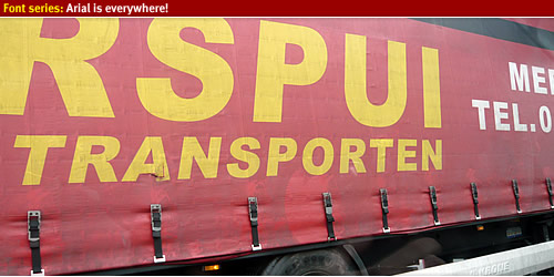
Highway truck
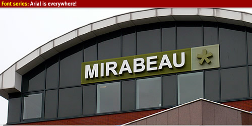
Mirabeau*
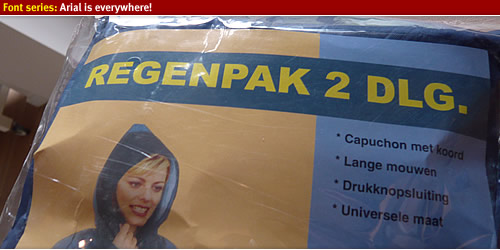
Clearing out the garage
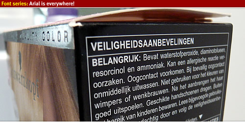
Swarzkopf
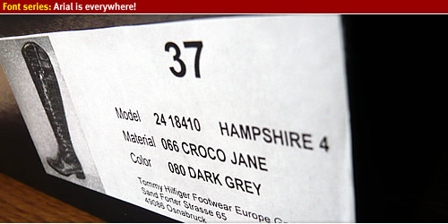
Tommy Hillfiger
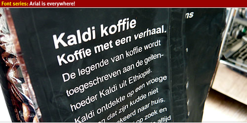
Kaldi Koffie
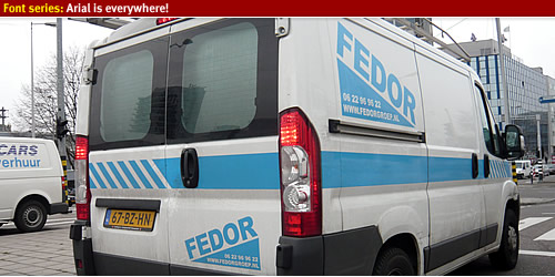
Vehicle signage
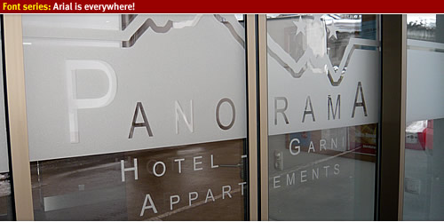
Hotel signs
Getting up the mountains

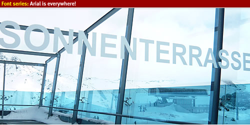
Sun terras
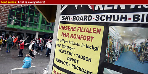
Ski rental
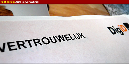
DigiD
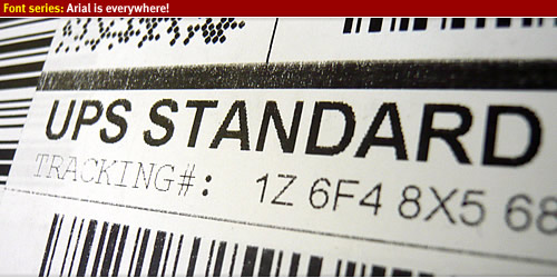
UPS
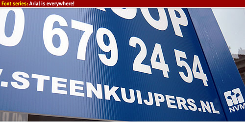
For sale sign
Design shop

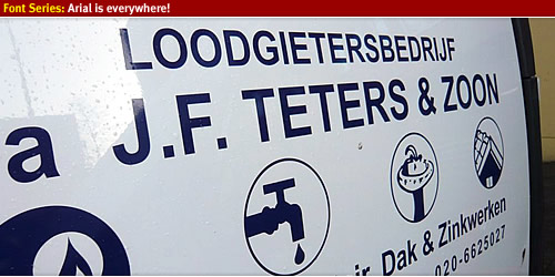
Plummer company

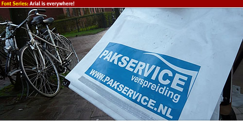
Bike bag
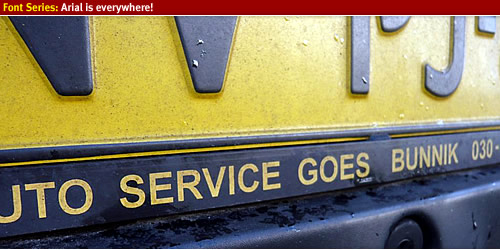
License plate holder
Vehicle signs
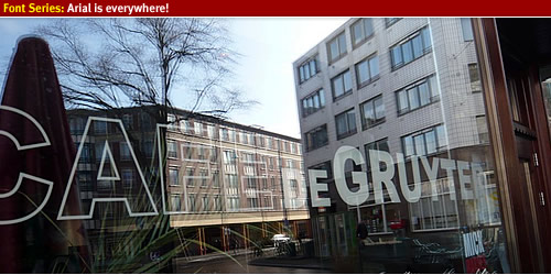
Local coffee bar
Arial is everywhere
Look around and you'll spot Arial around you! Arial is everyyyyyyywhere!!