Signs and color contrast
The definite guide into signage design and color usage. You will learn about the contrast ratio for displaying text on a colored background for signs.

Color contrast
The article will explore the meaning of color and how to differentiate color in information layers.
Contrast between the foreground and background is one of the most important factors for the ease of reading. If coloured text is used on a bright background the contrast will be weak, for optimal contrast results is white text against dark colored backgrounds. In signage & wayfinding design color is the combining factor to harmonize the sign with the environment. Color programs will distinguish signs from each other and can offer an indication of the message without having to be able to understand the language of the sign.
Basics of color groups: Color wheel
Swiss painter and designer Johannes Itten created a color wheel that is a organization of 12 color hues around in a circle showing relationships between the colors. The colors are presented in the following way:
- Primary colors: Blue, red & yellow
- Secondary colors: Green, orange & violet
- Complementary colors: Red–orange, red–violet, yellow–orange, yellow–green, blue–violet & blue–green.
Goethe’s Theory of Colours provided the first systematic study of the physiological effects of color (1810). His observations on the effect of opposed colors led him to a symmetric arrangement of his color wheel, “for the colours diametrically opposed to each other… are those which reciprocally evoke each other in the eye.” (Goethe, Theory of Colours, 1810)
Wikipedia
A Color Wheel is an abstract illustrative organization of color hues around a circle that shows relationships between primary colors, secondary colors and complementary colors. Knowing the relationship between colors is the first step in developing a color scheme for signage and wayfinding systems.
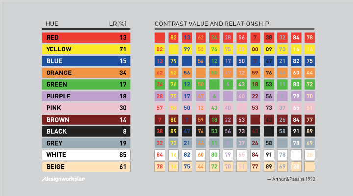
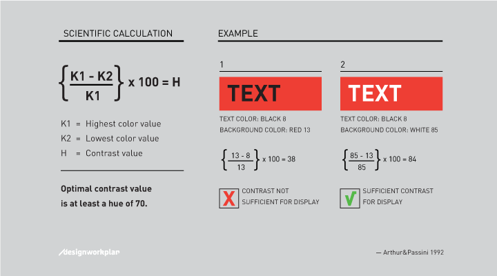
Color contrast by science
Arthur & Passini described in their book Wayfinding from 1992 a reliable calculating method to calculate the contrast difference between two colors. The formula is based on the light reflectancy (LR) readings in percentages for each of the two colors involved. By substracting the darker color from the lighter color, divided by the difference by the lighter, and multiplying by 100, we get brightness differential. When the brightness differential is 70 percent or higher the legibility is assured. When it is less, the legibility cannot be assured and those colors should not be using in that combination.
Color examples and meaning
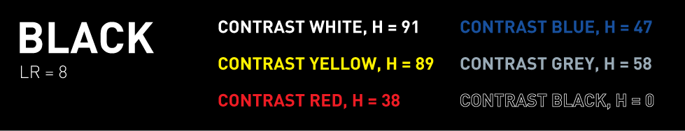
With a black background the lettering tends to stand out more onto to background than with other colored backgrounds. Black is one of the few surfaces that lets other colored text work great together. Beware of too small lettering with too high contrast (white lettering), these will lead to less legibility of the text because of overwhelming background. With large lettering white on black works great. Also yellow on black is a good combination.
Advisable work areas: Airport signage, office building signs, visual overwhelming environments, hotel signage, indoor usage.
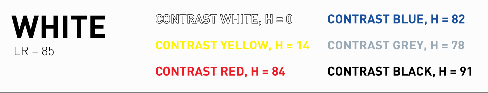
White background surface gives the most workable combinations, but beware of that white can absorb its environment. Black lettering tends to be squeezed into the background making it hard to read. Lower contrast lettering gives better results like blue, orange and red.
White backgrounds can be used specific sign projects where design plays a bigger part than the actual wayfinding. For instance using silver lettering on a white background can give fabulous results, due the shadow of the silver lettering the text becomes readable on the white surface.
Advisable work areas: Museum signage, office building signs, pylon signage, retail signage, hospital signage, indoor & outdoor usage.
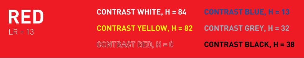
Red is often used for warning signs, red sends out a signal of warning, danger. Many of the warning signs consist of a red background with yellow or white lettering, by using pictograms as warning the signs are multi-language and don’t need explanation, even if you cannot read the text.
Red is a very powerful color which stands out in a visual crowded environment. I have seen various other signs produced with red but in my opinion red is a signal color. Works great with black, white and yellow lettering.
Advisable work areas: Warning signs, public spaces, indoor & outdoor usage.
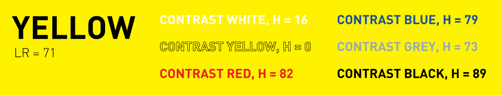
Yellow background works best in visual crowded environments, for architectural and psychological factors yellow is often used. Yellow with black lettering sends out a clear information message which is needed in such an environment. Using yellow also makes in easy to use orange, red and green which all work great together in a signage system.
Also for traffic signs yellow works good as background color in combination with black lettering. In a outdoor situation, yellow stands out from its background giving a clear message. In many European countries yellow is chosen as background color.
Advisable work areas: Airport signage, road signs, public spaces, indoor & outdoor usage.
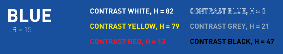
Blue is one of mankind favorite color, as is represents sky, heaven, trust and faith. The color blue is good recognized with white lettering as information sign. In the Netherlands all highway signs are with blue background as well as the railway signs.
To use blue in sign systems beware of create enough contrast in order to make the signs work best. For instance with light blue a higher contrast lettering will be needed such as black and for dark blue white lettering will work best.
Advisable work areas: Highway signs, railway signs, hotel signage, retail signage, public spaces, indoor & outdoor usage.
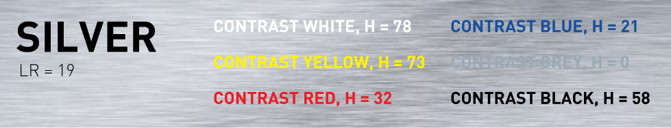
On a silver background almost all colors work well, even white. In future articles I will go deeper into using silver as background. Metal signs are frequently used in office signage, with black lettering it will create a very stylish look and feel.
Advisable work areas: Office signage, nameplate design, public spaces, indoor & outdoor usage.
Typography & color contrast
Not only is the contrast important also the chosen typeface will make the difference in a good or bad sign. When using too bold weighted typefaces the text will look like its expanding of the sign, when using too light weighted typefaces the text will fall back into its background. Medium or Regular weights are usually the best options to choose for a good and readable sign.