Airport signage
Inspiration and cases for airport wayfinding worldwide
Show the way
Airport signage design is not a easy task and creating a wayfinding system in a airport which will have to guide thousands of visitors takes a in-dept case study of the visual environment, travellers stream, detailed prints of the building and much more. In this photo showcase I’ve collected images of Airport Signage from cities all over the world, using the photo website flickr.
Airport Signage Design
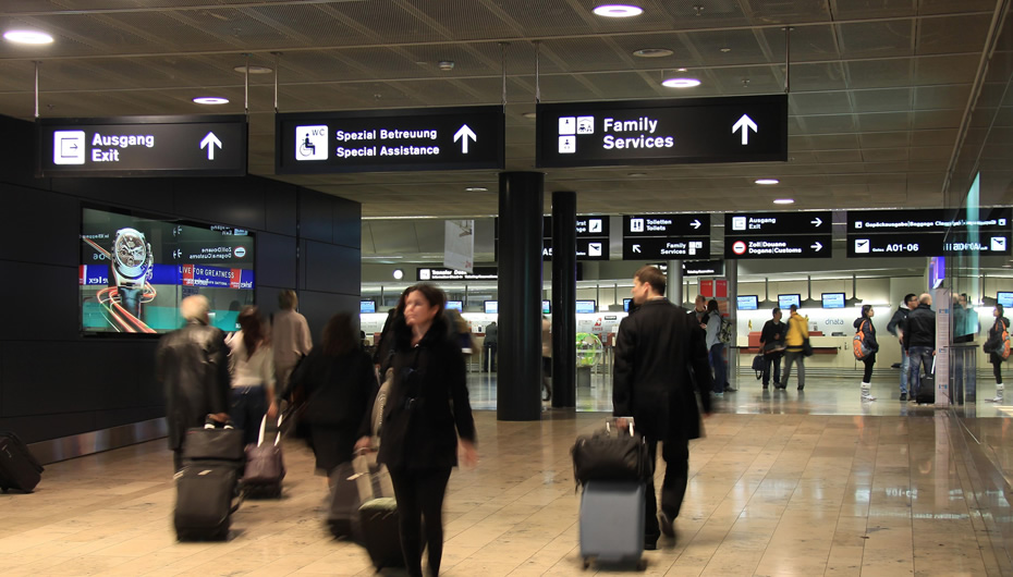
When designing signage for a Airport or a other public building you have to take a good notice of the visual surroundings the signage will be placed in. The backgound colors of walls and windows, the amount daylight let in the building, the lighting and more environmental elements are important when designing signage for a aiport.
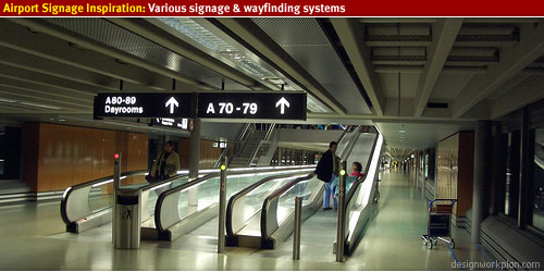
In a visual crowed environment it is important that signage design stands out to its background, for a maximum effect. Use a color system with not to many variations and be consistant with the color usage. Think about using illumnated signs to enhanche the readability of the signage and always use mockups of the signs to test if the signage is working in the visual surroundings.
Color, typography design and use of pictograms
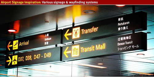
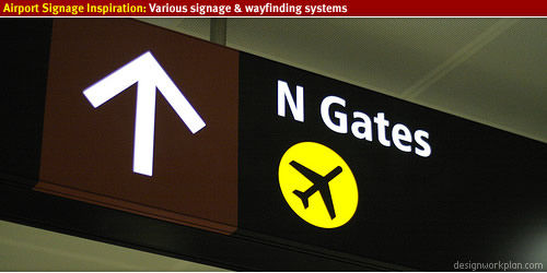
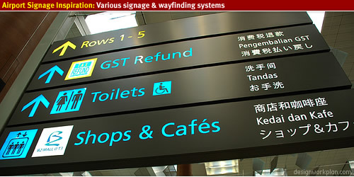
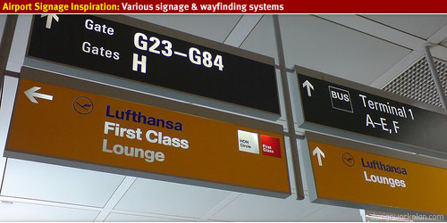
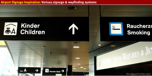
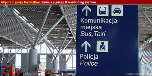
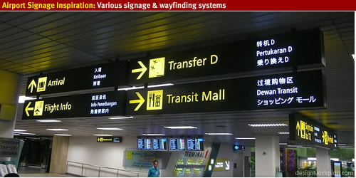
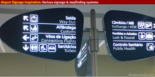
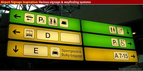
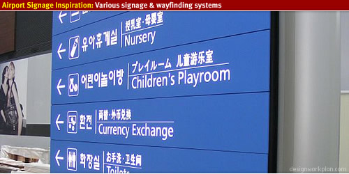
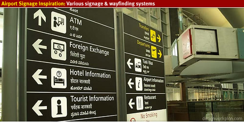
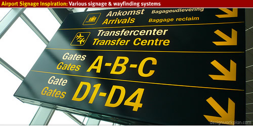
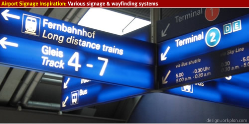
Design high contrast signs to ensure good readability and legibilty of the signage. Colors that work well are a dark background with a light colored text and pictograms. For example a black background with white illuminated lettering will ensure a high contrast which has a good readability from a distance. Other commen color combinations are a yellow background with black lettering.
For typography use a sans type like FF Info by Erik Spiekermann or Frutiger by Adrian Frutiger. Use a font that have a high x-height which will increase the legibility of the signs. Use only one font in all visual communication levels of the airport signage. For international airports it is vital to use symbols to indicate the facilities in and around the airport, always strengthen the symbol with written text in the native language and perforably in English language. This will ensure that most of the visitors can read the signs.
Arrow design
Arrows are one of the most important design features of a wayfinding system for airports, with a pointing arrow you will be able to guide visitors to their destination. Choosing a arrow within a design can make or break the design, don’t over due the arrow but gently incorporate the arrow into the sign in balance with type. Recently I’ve released a arrow collection to use in a design.
Sign design using a grid
Always use a grid to design signage & wayfinding systems in order to maintain balance and flexibility in the design. In a future article I will go in dept by explaining how to design signage using a grid.
Inspiration: Personal favourites
Below you will find a showcase of my personal 5 favourite airport signage designs. High contrast illuminated signs, using clear lettering.
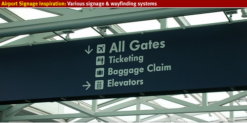
Seattle Airport Signage
Singapore Terminal 3 airport
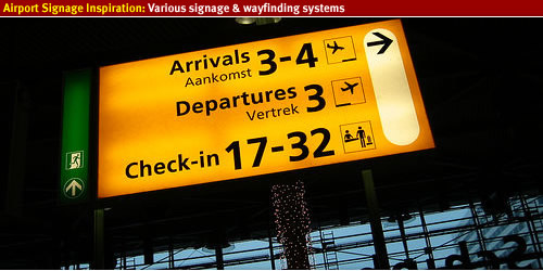
Schiphol Amsterdam
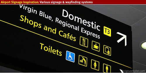
Melbourne Australia, Airport Signage
Portland International Airport Signage
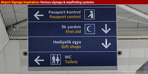
Ataturk Airport
Munich Airport Signage
Zürich airport signage
Warsaw Airport Signage
Singapore airport signage
Oporto’s new airport signage
Zürich basic signage
Berlin, Schönefeld Airport
Paris – CDG Airport Terminal 2
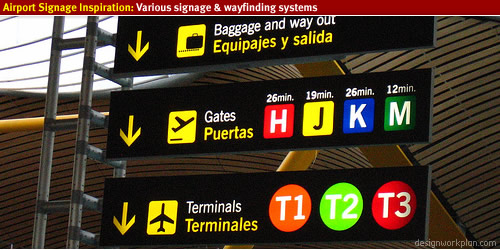
Madrid Airport
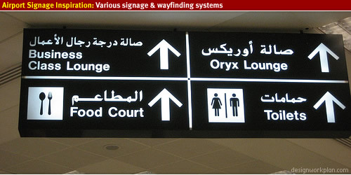
Doha, Qatar
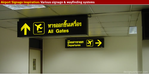
Thai airport signage
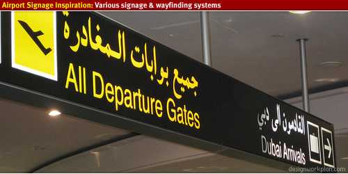
Dubai airport
Incheon International Airport
Bengaluru International Airport
Copenhagen airport signage
Frankfurt International Airport
Oaxaca City Airport
Malaysia’s KLIA airport